Color trends not only bring beauty to the workspace but also deeply impact the mood and performance of employees. In this article, Co-IDB will take you to explore the prominent color trends for 2025. Let’s predict and apply these colors to create a perfect workplace through the article below!
Application of Color in Office Interior Design
Explanation of Color Psychology Application
Color is not merely a decorative element in interior design; it is also a subtle “language” that strongly impacts human psychology and emotions. Many studies on color psychology have demonstrated that colors have the ability to stimulate various psychological responses, providing rich emotional experiences.
For example, warm colors like yellow and orange can create a cozy, friendly atmosphere, while cool shades like blue and green bring a sense of coolness and relaxation.
Changing Perception of Space
Colors in the office affect emotions and also have the ability to change how we perceive space. The subtle choice of colors can create a unique visual effect, helping the space feel more spacious, airy, or cozier and more intimate.
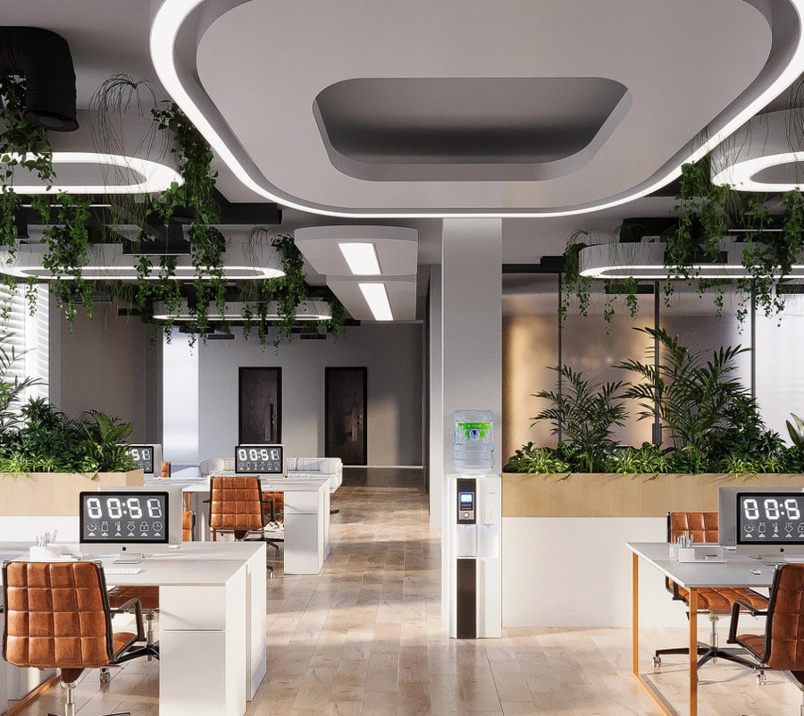
For instance, bright tones like white and beige make the room feel expansive and airy, while darker colors like deep grey or navy blue bring warmth, making the space feel more contained and friendly.
Results from Practice
Subtle changes in color choice can create surprising effects in the office space. In 2024, the three main color trends for offices included: Neutral tones, Bold and vibrant colors, and Earth tones. So, what changes will the color trends bring in 2025? Join Co-IDB to explore in the next section!
Top Color Trends Predicted to be Popular in Offices in 2025
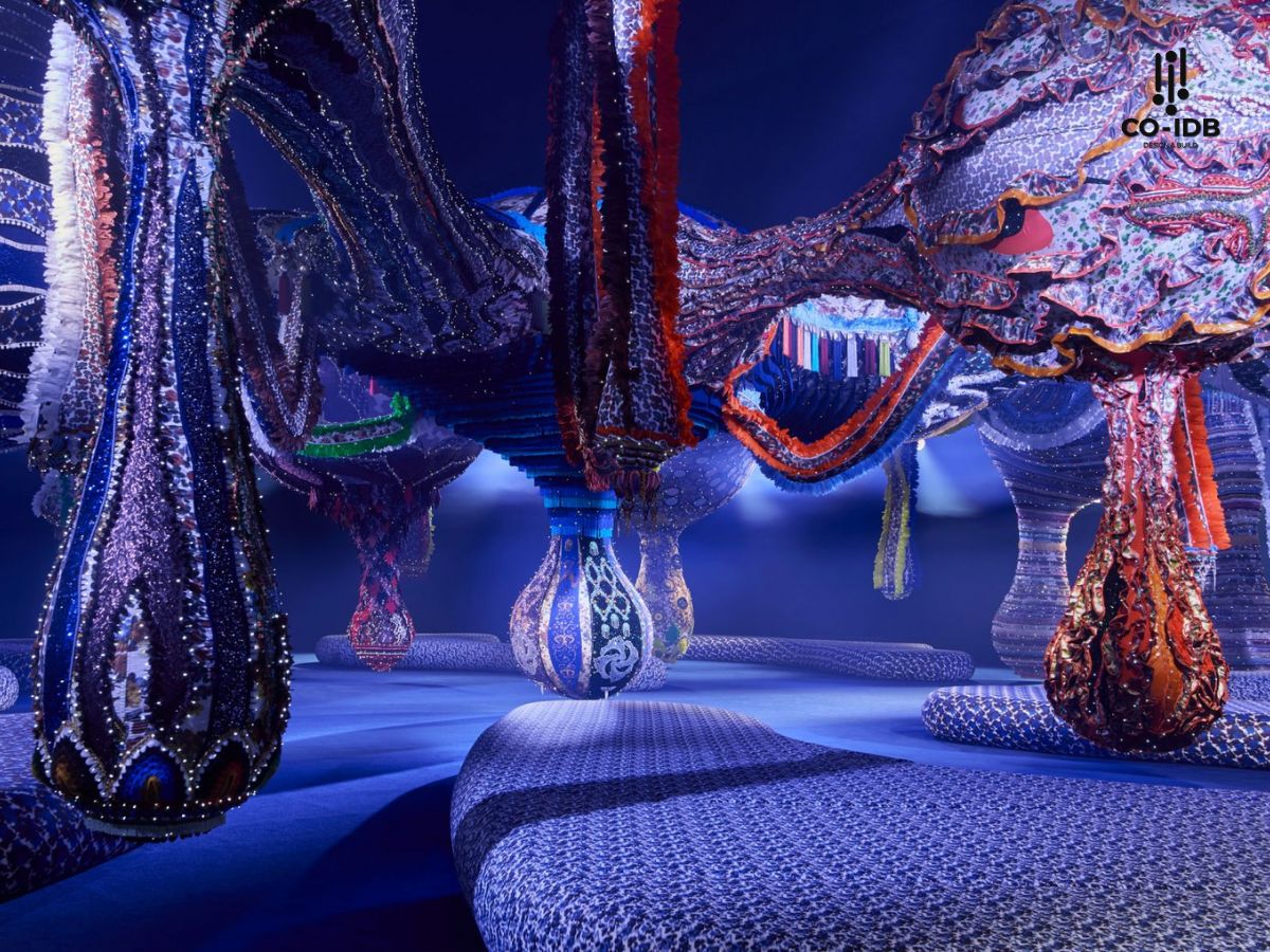
Future Dusk – The Color of 2025
Future Dusk (Coloro 129-35-18) is a dark blue-violet tone, bringing a mysterious allure and a feeling of movement between two worlds—real and virtual. This shade evokes the transition between dusk and dawn, or from darkness to light, reflecting the changes happening across fields such as social media, technology, environment, politics, industry, and creativity.
This is a versatile tone that can be flexibly applied across industries, including fashion and office interior design. Caroline Guilbert, Head of Creative Content at Coloro, comments: “Future Dusk is an inspiring shade, combining warmth and depth, creating a mysterious and timeless beauty.”
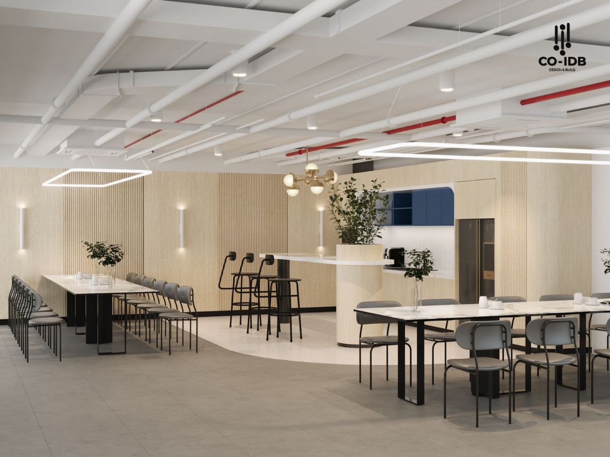
Neutral Tone
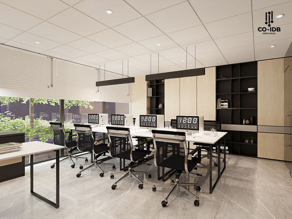
Neutral tones like grey, white, and beige are always an ideal and popular choice in office interior design. The preference for these color schemes comes from their ability to be easily paired with other colors, creating balance and harmony in the space. At the same time, neutral-colored interiors provide an elegant, sophisticated, and timeless look.
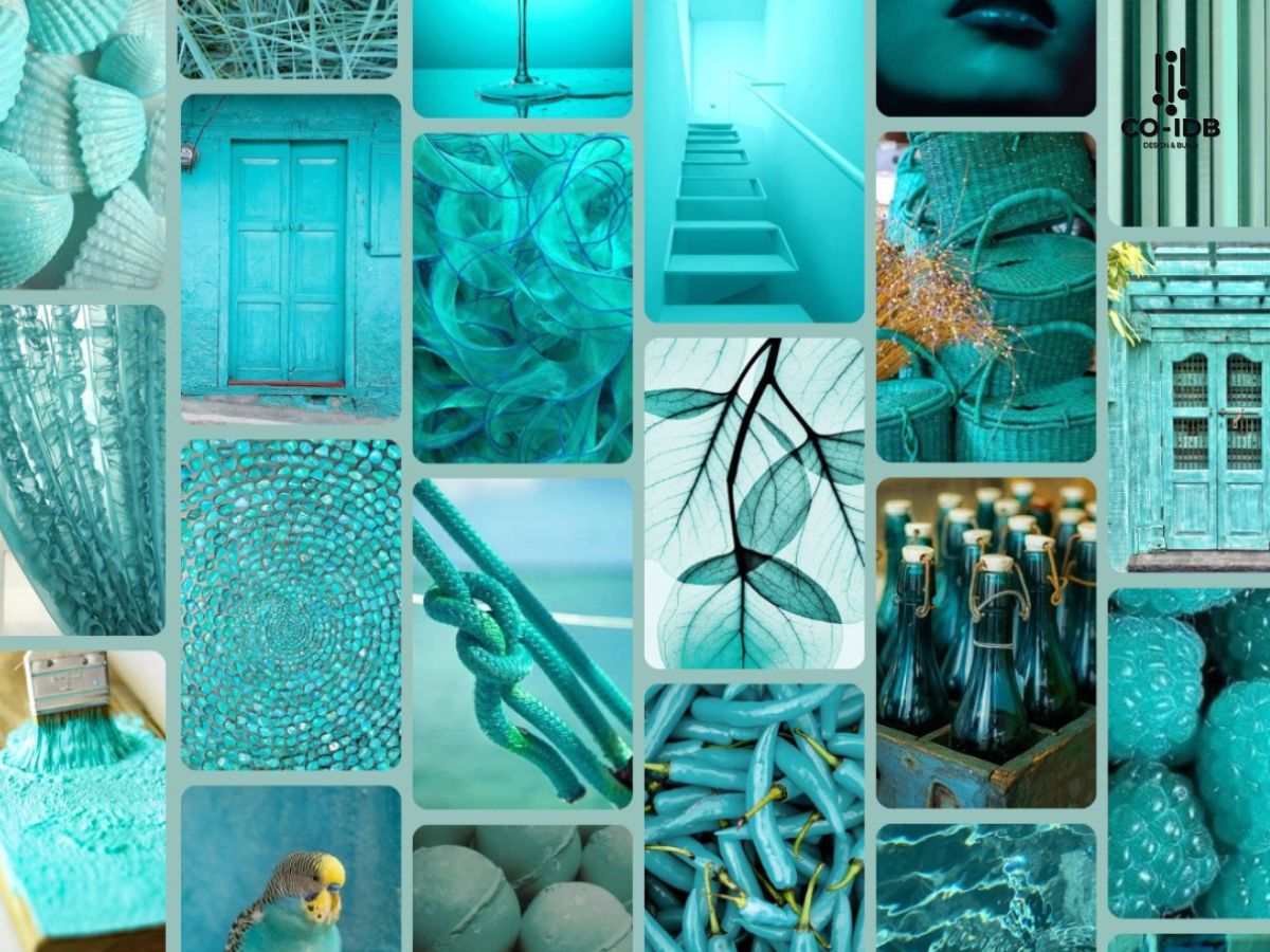
Aquatic Awe – Turquoise
Aquatic Awe is a vibrant turquoise shade that celebrates the magical and mysterious beauty of nature, inspired by marine life and ocean ecosystems. This color connects both the natural and virtual worlds, offering a multi-dimensional and fresh feeling.
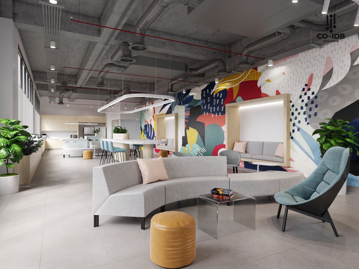
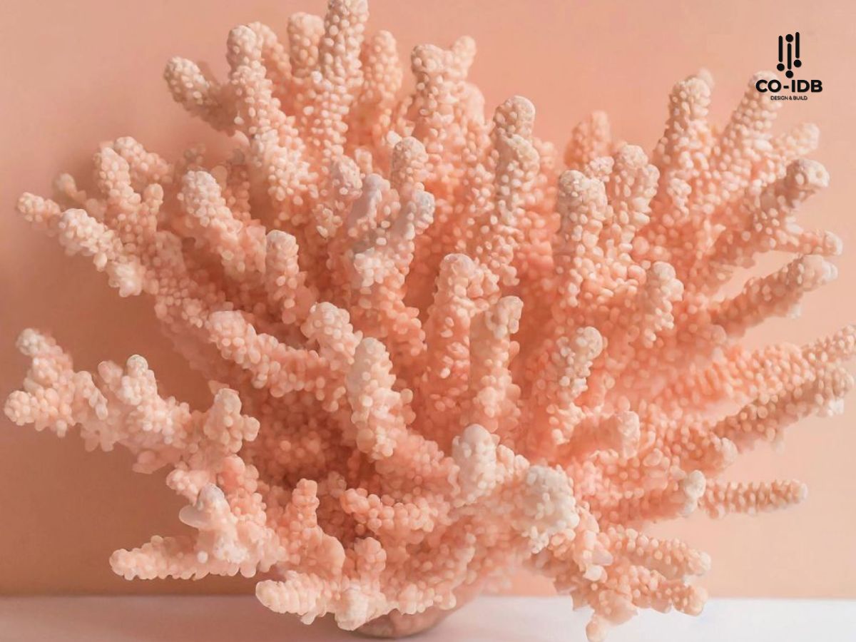
Sunset Coral
Sunset Coral is a color full of energy and cheerfulness, encouraging a slow-paced lifestyle, self-care, and appreciating moments of relaxation—things often overlooked in modern society. This color emphasizes the importance of joy in life and encourages us to seek moments of relaxation during stressful times, suitable for break areas.
Simultaneously, it also reflects the growing trend of conscious hedonism, emphasizing that joyful experiences should be linked to purpose and meaning in life.
>> See more: Brand Color – Harmonious Coordination Creates an Impression
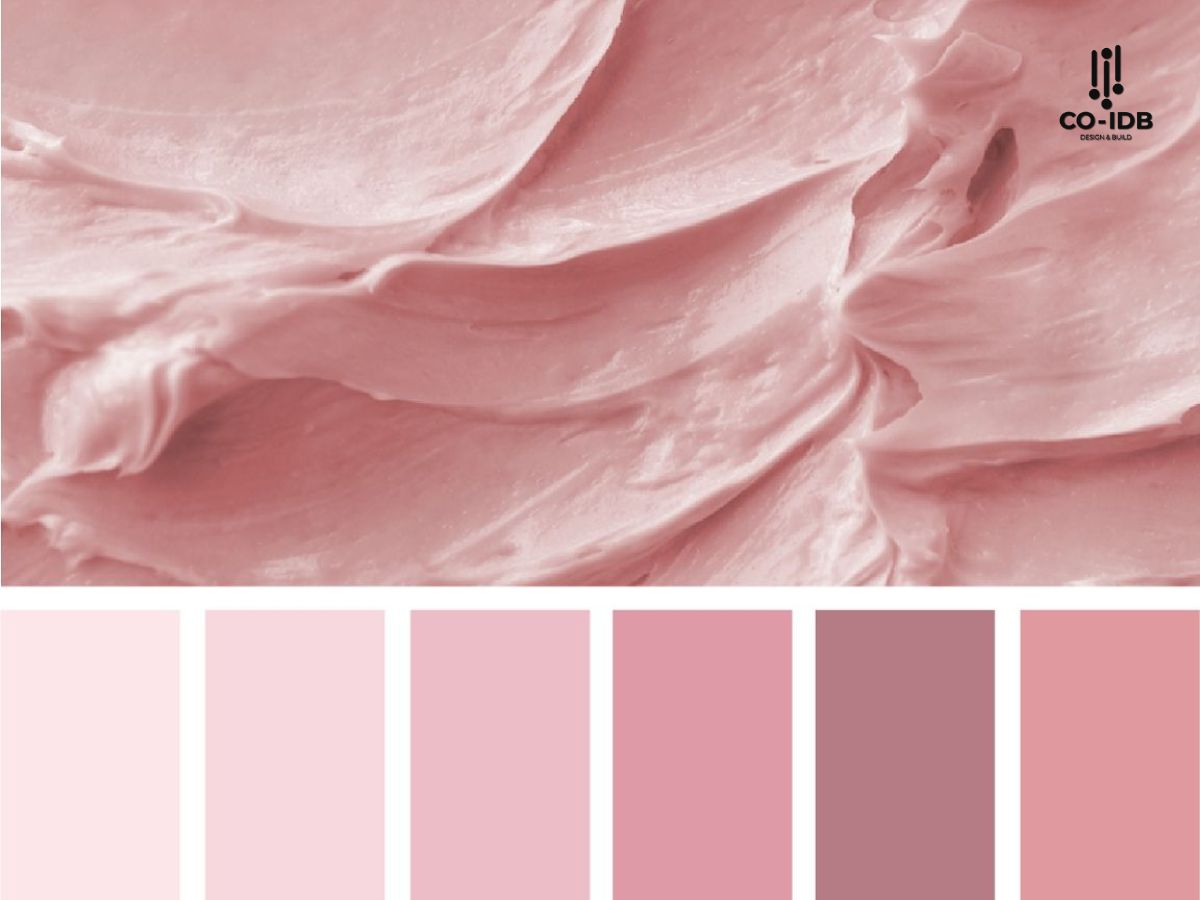
Transcendent Pink – Ethereal Pastel Pink
Transcendent Pink is a subtle light pink shade that feels more like a premium pastel than traditional pink. It has been observed in the studios of renowned architectural firms such as Grimshaw, Farshid Moussavi, HWKN,… Unlike other pinks, Transcendent Pink has a natural, gentle, earthy hue, providing a sense of stability and reliability.
Ray Flower – Sunflower Yellow
Ray Flower is a vibrant, warm yellow shade, inspired by regeneration activities aimed at protecting biodiversity. A typical example is the project by designer Jess Redgrave, where sunflowers are used as the sole raw material source to produce materials, from cellulose for the textile industry to pigments for dyes.
This color not only brings a healthy and optimistic feeling but also reflects the increasing sustainability trend, where the environment is considered an essential factor in design and production. The brilliance of Ray Flower also connects with the solar eclipse expected in 2025, making this shade a symbol of the link between humans and nature.
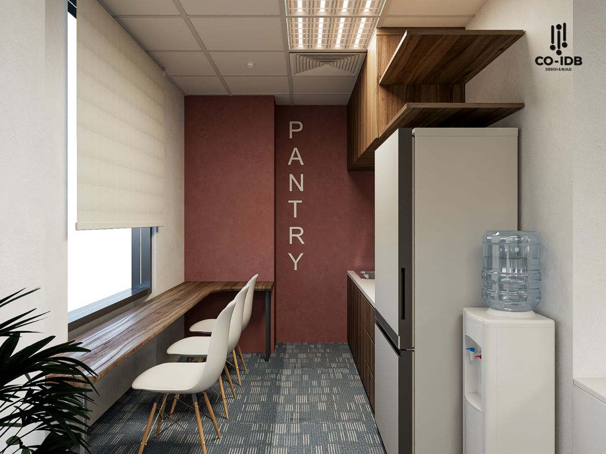
Ruby Red
In the fields of interior design, construction, and design, BEHR recently introduced the 2025 color trend with the shade Rumors – a prominent and powerful Ruby Red.
Rumors is a deep ruby red, simultaneously warm and luxurious, creating depth and vibrancy for the space, completely different from common neutral shades. When combined with dark colors, Rumors brings a feeling of power and novelty; when color-matched with light or neutral colors, it exudes elegance and warmth.
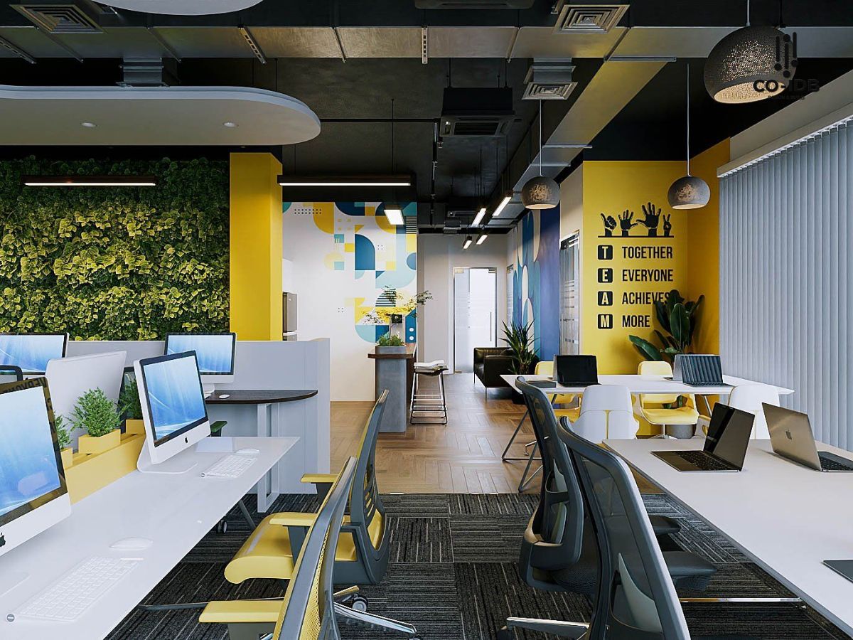
Metallics
The trend of using metallic colors like gold, silver, and copper in interior design is increasingly favored due to their ability to create accents and bring luxury to the space. These shades not only highlight interior details but also contribute to creating a modern and stylish work environment.
In office spaces, metallic fixtures and accessories such as door handles, tables and chairs, or desk lamps can create a sophisticated and inspiring workspace.
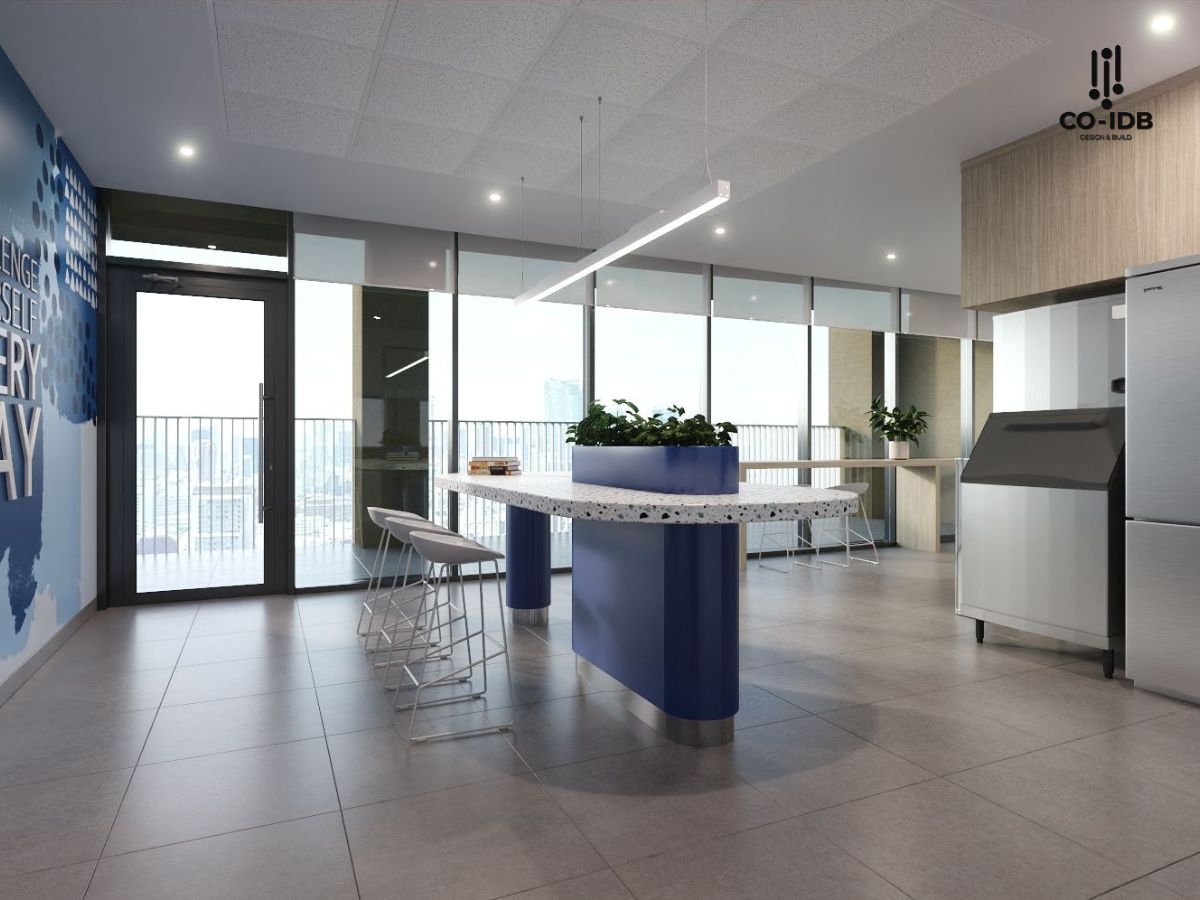
Classic Blue
Classic Blue has emerged as a trend in interior design thanks to its sustainability and timeless beauty. This shade not only represents peace, stability, and reliability—essential factors in a volatile world—but is also easy to combine with various colors and design styles, from modern to classic, creating an elegant and aesthetic living space, ideal for areas like rest rooms and reception rooms.
In the office environment, Classic Blue not only helps enhance concentration and creativity but also brings a professional and modern feel when combined with natural wood furniture.
Bringing 2025 Color Trends into Your Office Space
Now that you’ve grasped the color trends for 2025, how do you integrate them into your office space? Here are a few simple ways to start:
-
Combine and Mix: Experiment with different color combinations to create a unique look for the space. Combining light and dark tones will bring depth and interest to the office.
-
Add Accents: Use trending colors as accent points to create appeal and personality for the space, such as a standout feature wall or vibrant colored accessories to create focal points.
-
Natural Light: Don’t forget that natural light can affect how colors appear in the office. Maximize natural light to highlight the chosen colors.
-
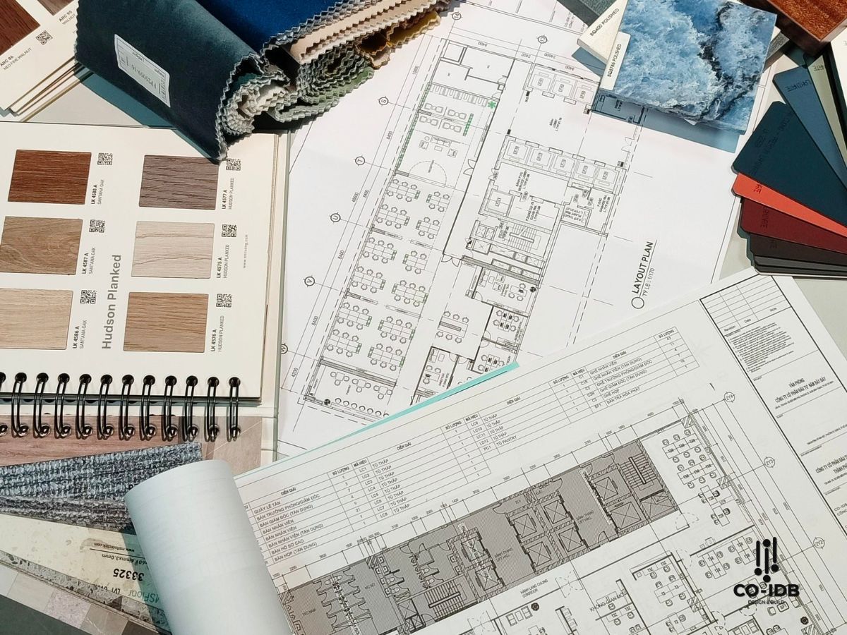
Samples and Swatches: Before making a final decision, test color samples and materials in the space. This will give you a more visual and accurate view of how the colors will interact with each other in the actual environment.
The color trends for 2025 promise to bring exciting innovations to the workspace. By combining prominent and sophisticated colors, you not only help create an impressive work environment but also enhance morale and work performance. If you need more information and detailed consultation on how to apply these color trends, contact Co-IDB now!