Index
ToggleOffice color composition plays a decisive role in creating a professional impression and fostering business relationships by influencing psychology to enhance positivity in decision-making processes.
This article provides a detailed analysis of color layout principles, color psychology in business, and methods to optimize workspaces through color. By exploring these factors, businesses can build office spaces that reflect their brand identity and create a professional working environment.

The Importance of Color Composition in Modern Offices
First Impressions for Clients and Partners
The first impression, also known as the primacy effect regarding an office, strongly influences the decision to cooperate by partners and clients. Environmental psychology research shows that humans form 75% of their evaluation of an organization within the first 3 minutes of entering a workspace. Office color composition plays a key role in creating a professional and trustworthy impression.
Color elements that impact first impressions include:
-
Harmony in the overall color scheme
-
Color highlights in the reception area
-
Color contrast suitable for the brand
-
Lighting and its interaction with colors

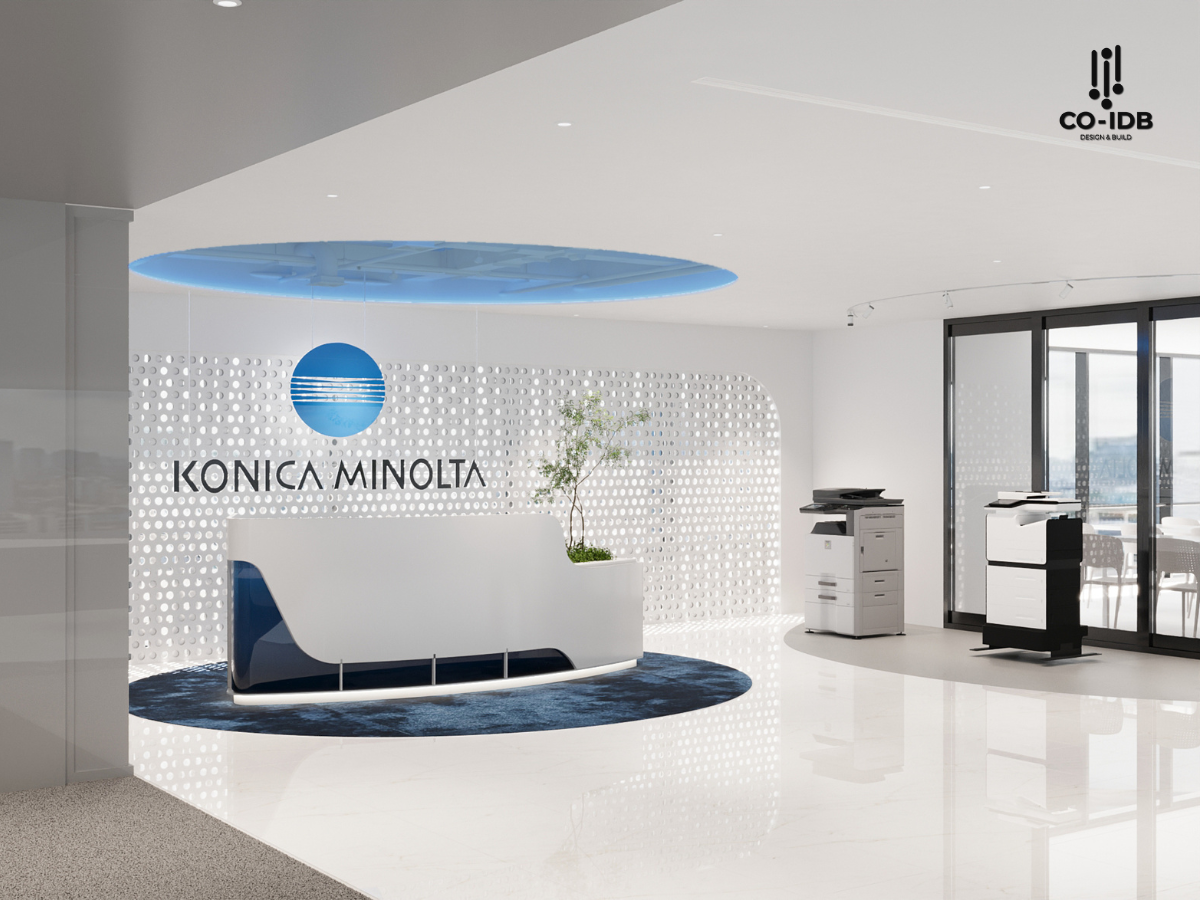
A reception space designed with a professional color layout can increase the likelihood of gaining favor from potential partners by 60%. Incorporating brand colors subtly in this area helps customers recognize and remember the brand 45% better.
Impact on Corporate Branding
The office color layout directly communicates messages about brand positioning and values. Color is not just an aesthetic element but also a tool for building strong brand recognition in the minds of partners and customers.
|
Color Element |
Branding Impact |
Practical Application |
|
Primary Color |
Industry positioning |
Walls and main spaces |
|
Secondary Color |
Enhanced recognition |
Furniture and highlights |
|
Accent Color |
Creating impressions |
Logos and display areas |
Statistics show that businesses with an office color layout consistent with their brand identity are rated 55% more professional than their competitors. Consistency in color usage helps enhance brand value and build trust with customers.

Influence on Partnership Decisions
Office color composition directly affects the psychology and decision-making process of potential partners. A working environment designed with appropriate colors can:
-
Increase contract signing rates by 40%
-
Extend customer interaction time by 25%
-
Enhance business referral capability by 35%
-
Improve evaluation of professional competence by 50%
Colors in negotiation spaces need to be specifically designed to create a positive psychological state and encourage decision-making. Color tones such as light blue and neutral gray are proven to have a positive impact on reaching consensus during business negotiations.

Fundamental Principles of Color Composition
The principle of balance in office color composition serves as the foundation for a professional space. Color balance is expressed through several main forms, each bringing distinct aesthetic and functional values.
Symmetrical Balance
Symmetrical balance in an office creates a sense of stability and professionalism through:
-
Using the same colors on both sides of an axis
-
Even distribution of color elements
-
Creating a central focal point
|
Balance Type |
Application |
Psychological Impact |
|
Symmetrical |
Meeting rooms, Reception |
Professional, Credible |
|
Asymmetrical |
Creative spaces |
Dynamic, Modern |
|
Radial/Coordinate |
Shared work areas |
Orderly, Efficient |

Emphasis Through Contrast
Color contrast creates focal points and draws attention within the office space. Contrast techniques are applied through:
-
Color Contrast:
-
Using complementary colors
-
Combining warm and cool tones
-
Intentional color gradients
-
-
Light-Dark Contrast:
-
Creating spatial depth
-
Guiding the flow of movement
-
Dividing functional areas
-

Rhythm and Movement
Color rhythm in an office creates a vivid space with a sense of direction. Elements that create rhythm include:
-
Regular Repetition:
-
Periodic appearance of brand colors
-
Color patterns across functional areas
-
Color accents placed at intervals
-
-
Visual Movement:
-
Directional color gradients
-
Color contrast creating movement flows
-
Linear color highlights
-

Common Types of Color Layouts in Office Spaces
Monochromatic Color Layout in Office Design
A monochromatic color layout creates a sophisticated and professional office space through the use of different shades, tints, and tones of the same color. This method is particularly effective in creating spatial depth without visual clutter. Gray and beige tones are often favored in monochromatic design for their ability to create a neutral foundation while easily pairing with brand color accents.
-
High Unity:
-
Creates a seamless feel within the space
-
Easily integrates with brand colors
-
Minimizes visual distraction
-
Professionalism:
-
Demonstrates sophistication in design
-
Enhances work focus
-
Creates a luxurious environment
-
Easy Maintenance:
-
Simple to replace and repair
-
Long-term cost savings
-
Easily updated to follow trends
|
Monochromatic Color |
Psychological Impact |
Suitable Space |
|
Gray |
Professional, stable |
Meeting rooms, work areas |
|
Beige |
Warm, friendly |
Reception areas |
|
White |
Clean, spacious |
Common spaces |
|
Light Blue |
Focus, creative |
Brainstorming rooms |

Color Layout by Functional Area
Dividing colors by functional areas helps optimize work efficiency and creates a highly directional space.
|
Area |
Recommended Color Palette |
Purpose |
|
Reception/Lobby |
Neutrals + Brand colors |
Create a professional impression |
|
General Workspace |
Light blue, soft gray |
Increase focus and performance |
|
Meeting Rooms |
Blue, charcoal |
Encourage thinking and interaction |
|
Breakroom/Pantry |
Warm, bright colors |
Relaxation and energy recovery |

Color Layout in Open Workspaces
Open workspaces require a subtle strategy for area division through color. Modern businesses use color to create virtual boundaries between work zones while maintaining connectivity and interaction. Color gradients and soft transitions help guide the flow of movement within the office without creating a stark sense of separation.
Methods for dividing space using color:
-
Using carpets with different colors
-
Accent walls for each functional area
-
Furniture with characteristic palettes per group

Office color composition acts as a strategic tool in building a professional corporate image and attracting partners and clients. Applying scientific color design principles, combined with modern trends and industry specifics, will create an efficient and impressive working environment. Businesses should focus on maintaining and updating their color layout to ensure the long-term sustainability of their workspace.
> See more:


