Brand color is an indispensable element in enhancing the brand recognition of a business, product, or service. Choosing the right palette not only demonstrates aesthetic appeal but also bridges the gap between a brand and its target audience. How do you determine which colors will best highlight your corporate values? Let Co-IDB explore the psychology and application of brand colors in the article below.

Defining Brand Colors
Brand colors are key factors that create a brand’s unique identity. Research shows that customers perceive and remember a brand first through its color, then its name. Therefore, specific colors suit different industries and business models:
- 84.7% of consumers claim color is the primary reason they decide to purchase a product.
- 80% of consumers believe color improves brand recognition.
- Between 62% and 90% of a consumer’s initial impression of a product is based on color alone.
- Color can increase brand awareness by 73%, learning by 68%, and reading comprehension by 40%.
Selecting colors for logo design and visual identity is more than an aesthetic choice; it is a strategic decision rooted in Color Psychology.
The Meaning of Core Brand Colors
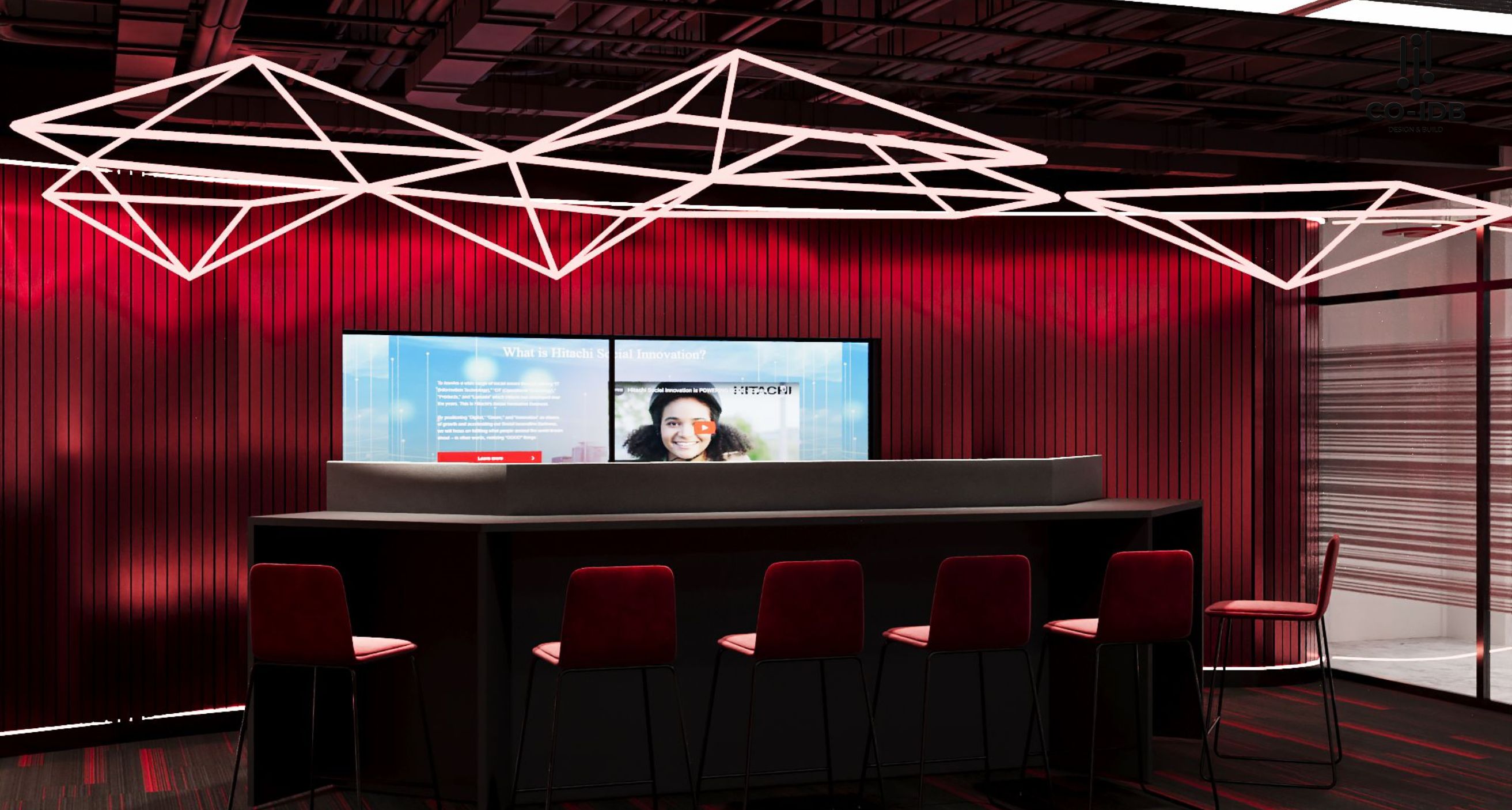
Red: Energy and Passion
Red evokes dynamism, strength, and youthful enthusiasm. It can represent romance and mystery or urgency and danger depending on the context. Scientifically, red can trigger physiological changes in viewers, such as stimulating the appetite—which is why it is the “go-to” color for food giants like Coca-Cola, Chin-su, and Kellogg’s.
See more: Aesthetic Principles in Interior Design
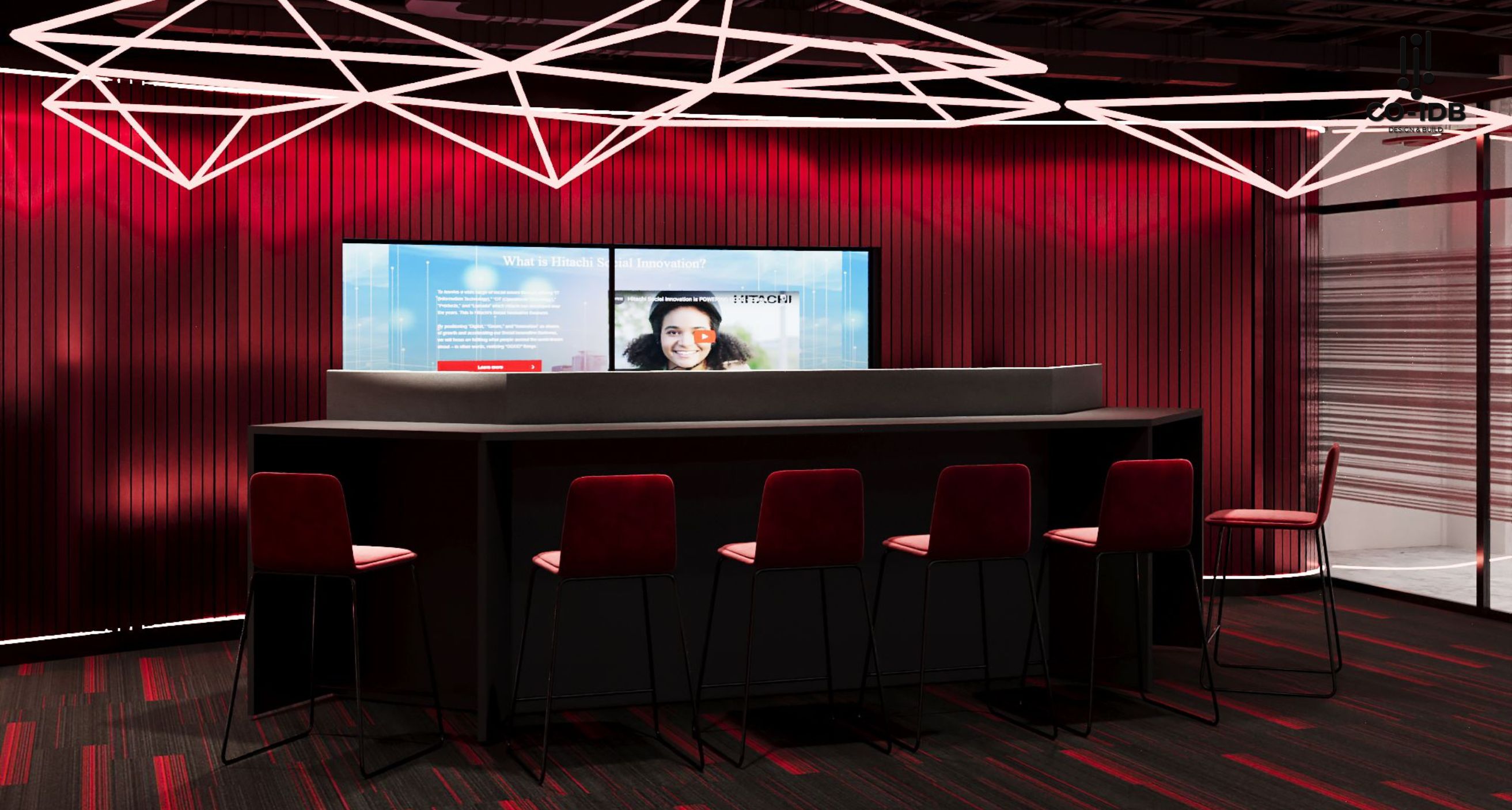
Office Application Tips for Red:
- Use as an accent: Instead of painting entire walls, use red for chairs, cushions, or artwork to prevent sensory overload.
- Balance with neutrals: Pair red with white, gray, or beige to stabilize the visual energy.
- Select the right shade: Use deep crimson for luxury and maturity, or bright scarlet for creative, high-energy zones.
Yellow: Optimism and Creativity
As the color of sunshine, yellow radiates positive energy and warmth. Research suggests yellow stimulates the analytical side of the brain, linking it to creativity and superior logic. Brands like McDonald’s and Lotteria use yellow to create a friendly, high-energy atmosphere.
Office Application Tips for Yellow:
- Reception Areas: Ideal for creating a warm, welcoming first impression.
- Creative Hubs: Boosts brainstorming and energy, though it should be used sparingly to avoid causing eye strain.
Blue: Trust and Professionalism
Blue is the “King” of logo design, featured in over half of the world’s logos. Tech giants like Dell, IBM, and Intel use blue to emphasize intelligence and reliability. It is also associated with authority, making it the standard choice for financial institutions and government agencies.
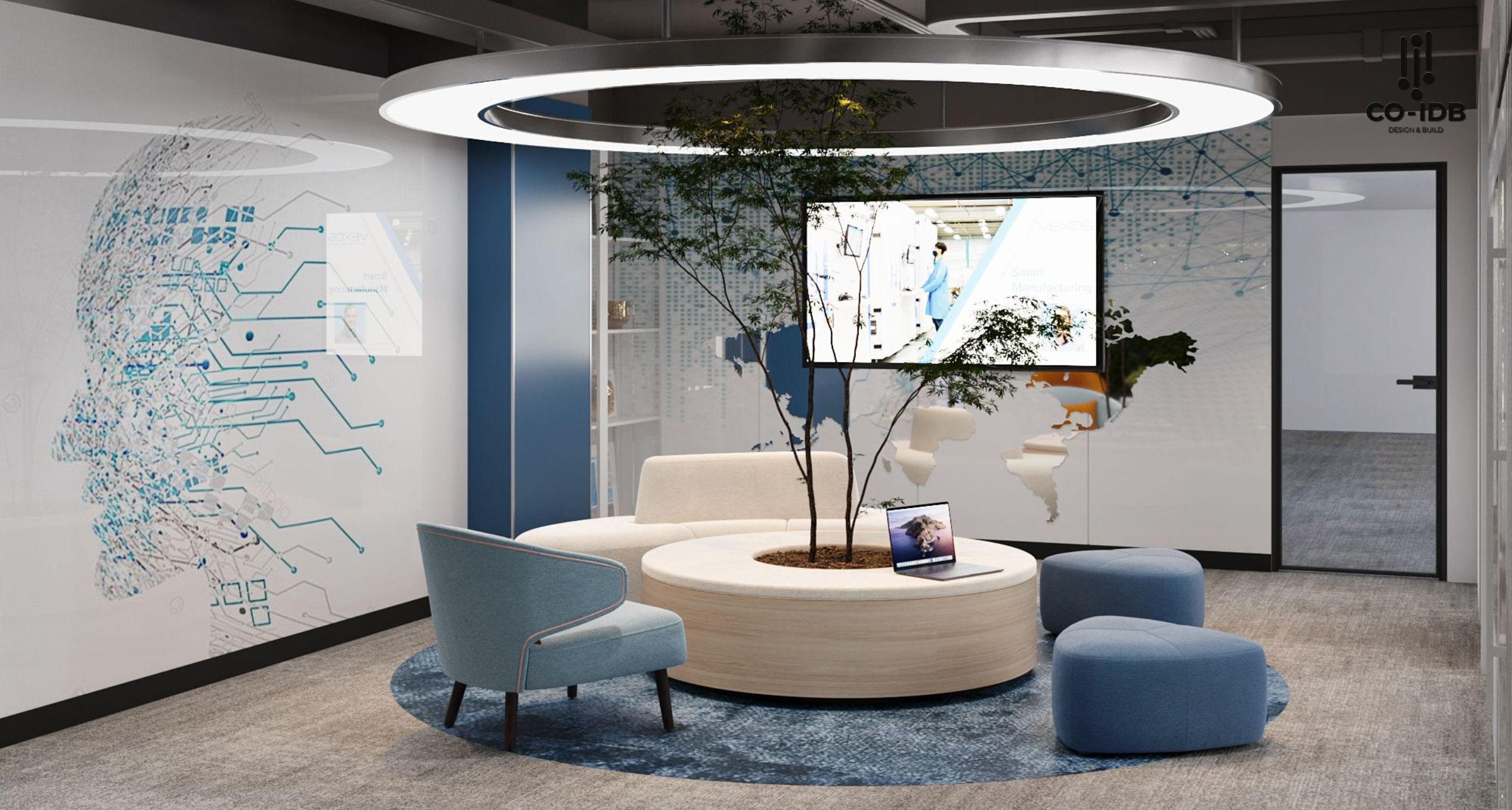
In office design, blue is the ideal color for concentration and productivity, perfect for individual workstations or high-stakes meeting rooms.
Green: Growth and Sustainability
Green is synonymous with environmental movements, nature, and health. It is the primary color for organic and eco-friendly brands. When applied to office design, different tones serve different functions:
- Light Green: Ideal for calm spaces like breakrooms or meditation zones.
- Mint Green: Stimulates imagination in creative collaborative spaces.
- Dark Green: Perfect for executive offices, conveying safety and prestige.
Core Principles of Color Design
Primary, Secondary, and Tertiary Colors
- Primary: Red, Yellow, and Blue (RYB). These cannot be created by mixing other colors.
- Secondary: Orange (Red+Yellow), Purple (Blue+Red), and Green (Yellow+Blue).
- Tertiary: Created by mixing a primary color with a secondary neighbor (e.g., Magenta, Teal, Amber).

Warm vs. Cool Tones
- Warm Colors: Range from Magenta to Yellow. These create a sense of sunlight, heat, and activity.
- Cool Colors: Range from Purple to Chartreuse. These provide a refreshing, calm, and spacious feeling.
Brand colors play a pivotal role in visual identity and significantly influence customer psychology. Selecting a palette that aligns with your brand’s personality is the first step toward building a sustainable brand. If you have any questions regarding color integration in your workspace, contact Co-IDB for a free consultation.
>>> See more: