Color saturation fundamentally shapes visual effectiveness in office design. From a color science perspective, saturation represents the level of color purity—the higher it is, the more vibrant; the lower it is, the more it fades toward gray. This article explores in detail how to apply color saturation in office design, from basic principles to practical implementation techniques, helping you optimize your workspace.

What is Color Saturation?
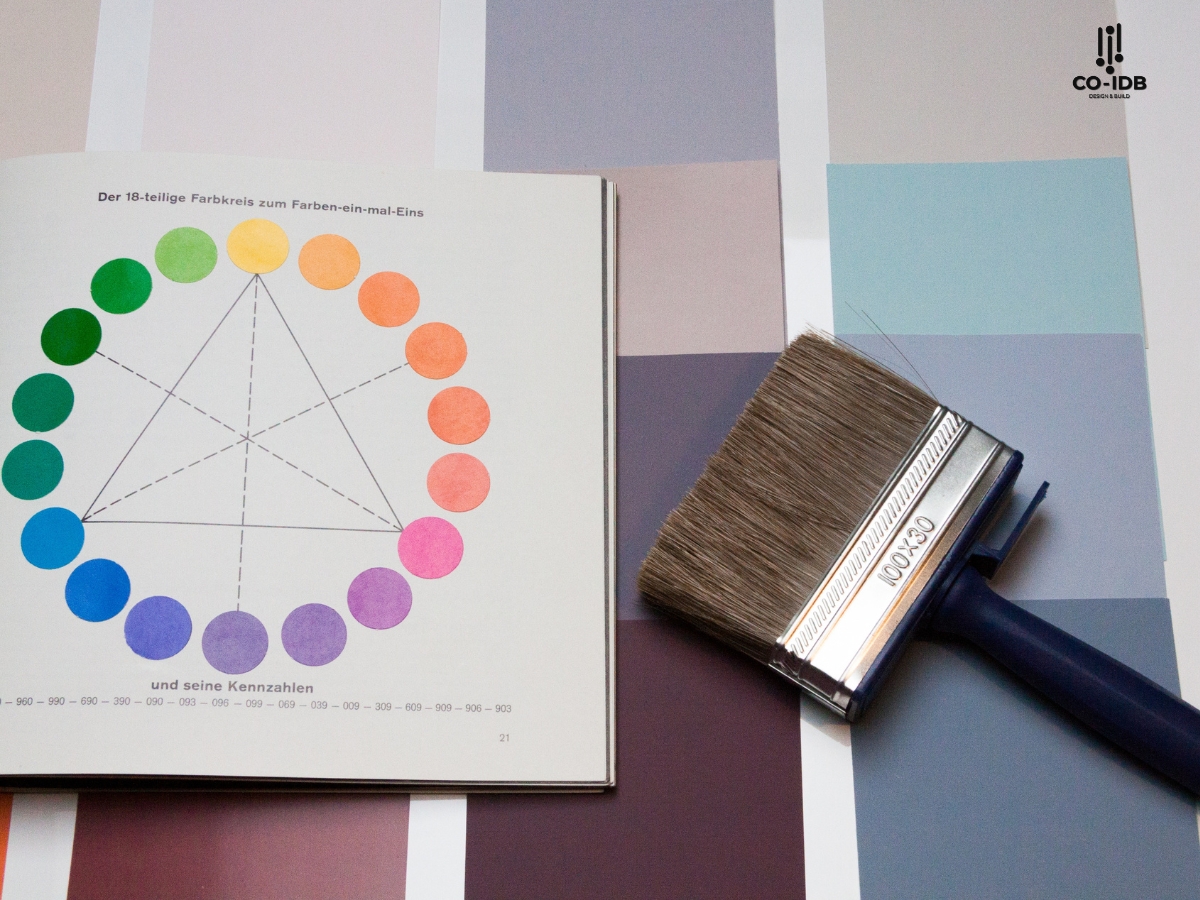
Color saturation is defined as the degree of color purity relative to a gray of the same brightness. In color theory, this attribute measures the intensity or purity of a color. When a color is 100% saturated, it is in its purest form; conversely, 0% saturation results in shades of gray.

Table 1: Classification of Color Saturation and Characteristics
|
Saturation Level |
Characteristics |
Psychological Impact |
Suitable Application |
|
High (80-100%) |
Vibrant, Bold |
Stimulating, Dynamic |
Accents, Creative Zones |
|
Medium (40-79%) |
Balanced, Pleasant |
Comfortable, Focused |
General Workspaces |
|
Low (0-39%) |
Soft, Subtle |
Calm, Professional |
Meeting Rooms, Quiet Zones |
Basic Principles of Color Saturation
Color principles indicate that saturation directly affects visual perception. In an office setting, understanding this helps create an optimal environment. Three factors to consider when working with saturation:
-
Correlation with Brightness:
-
High brightness reduces perceived saturation.
-
Low brightness enhances perceived saturation.
-
A balance between the two is necessary.
-
-
Relationship with Space:
-
Large spaces should use low saturation.
-
Small spaces can handle higher saturation.
-
Accents require higher saturation levels.
-

Measurement Systems for Color Saturation
Modern technology provides various methods to measure saturation accurately. The HSB/HSV color system is most commonly used in office design, with the S (Saturation) component measuring saturation directly.
Table 2: Comparison of Saturation Measurement Systems
| System | Advantages | Disadvantages | Common Tools |
| HSB/HSV | Intuitive, Easy to adjust | Not perfectly linear | Adobe Photoshop, Sketch |
| RGB | Standard for digital | Hard to adjust saturation directly | Digital screens, Cameras |
| CMYK | Precise for printing | Narrower color gamut | Printers, Print design |
Applying Color Saturation in Office Design
Each functional area requires different saturation levels to optimize efficiency. This division is based on the nature of the work and the duration of use. In focused work areas, medium saturation helps maintain long-term concentration without causing fatigue. Conversely, creative zones can use higher saturation to stimulate breakthrough thinking.
Here are ways to apply saturation to optimize office space:
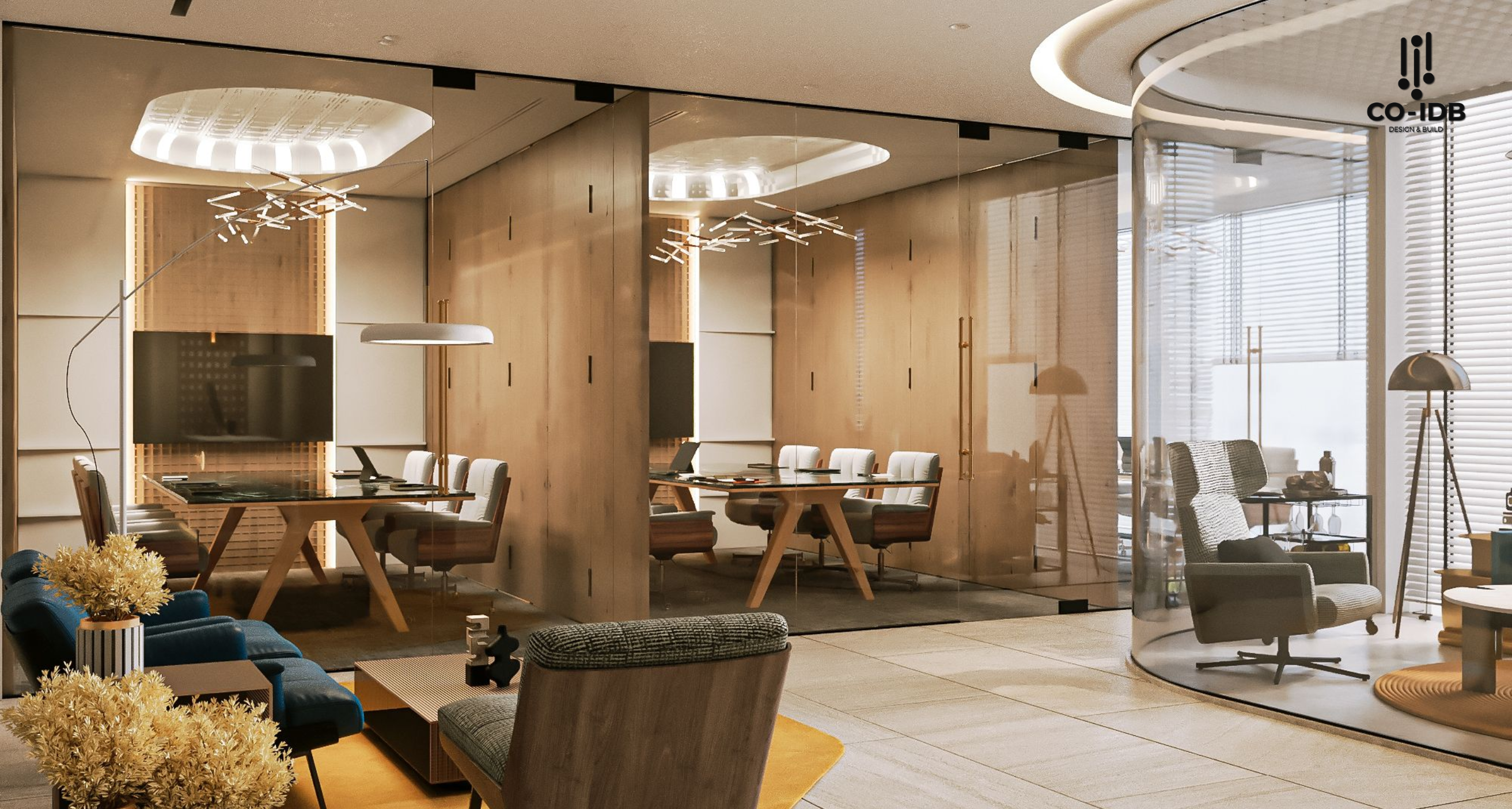
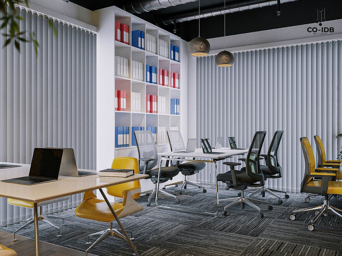
1. Creating Dynamic and Creative Spaces
-
High saturation colors like orange, red, or deep blue help stimulate creativity and energy.
-
Suitable for brainstorming rooms or teamwork areas, giving employees extra motivation and new ideas.

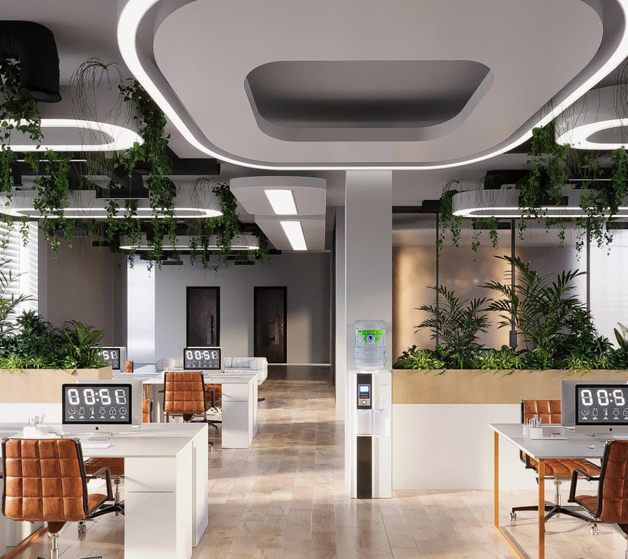
2. Promoting Focus and Performance
-
Medium saturation colors like green or light blue create a sense of balance and reduce eye strain.
-
Ideal for individual workstations and meeting rooms, helping employees stay focused.
3. Providing Comfort and Stress Reduction
-
Low saturation colors like pastels (pale pink, mint green) bring gentleness and relaxation.
-
Suitable for breakout areas and relaxation rooms, helping staff destress after intense work hours.
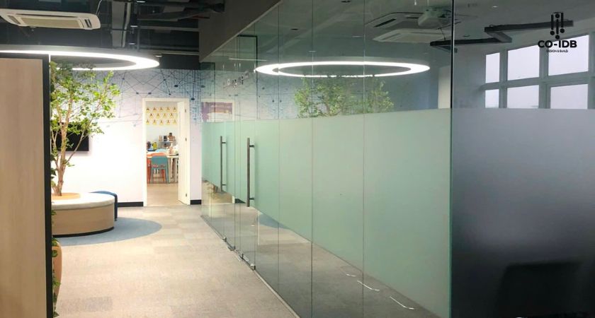
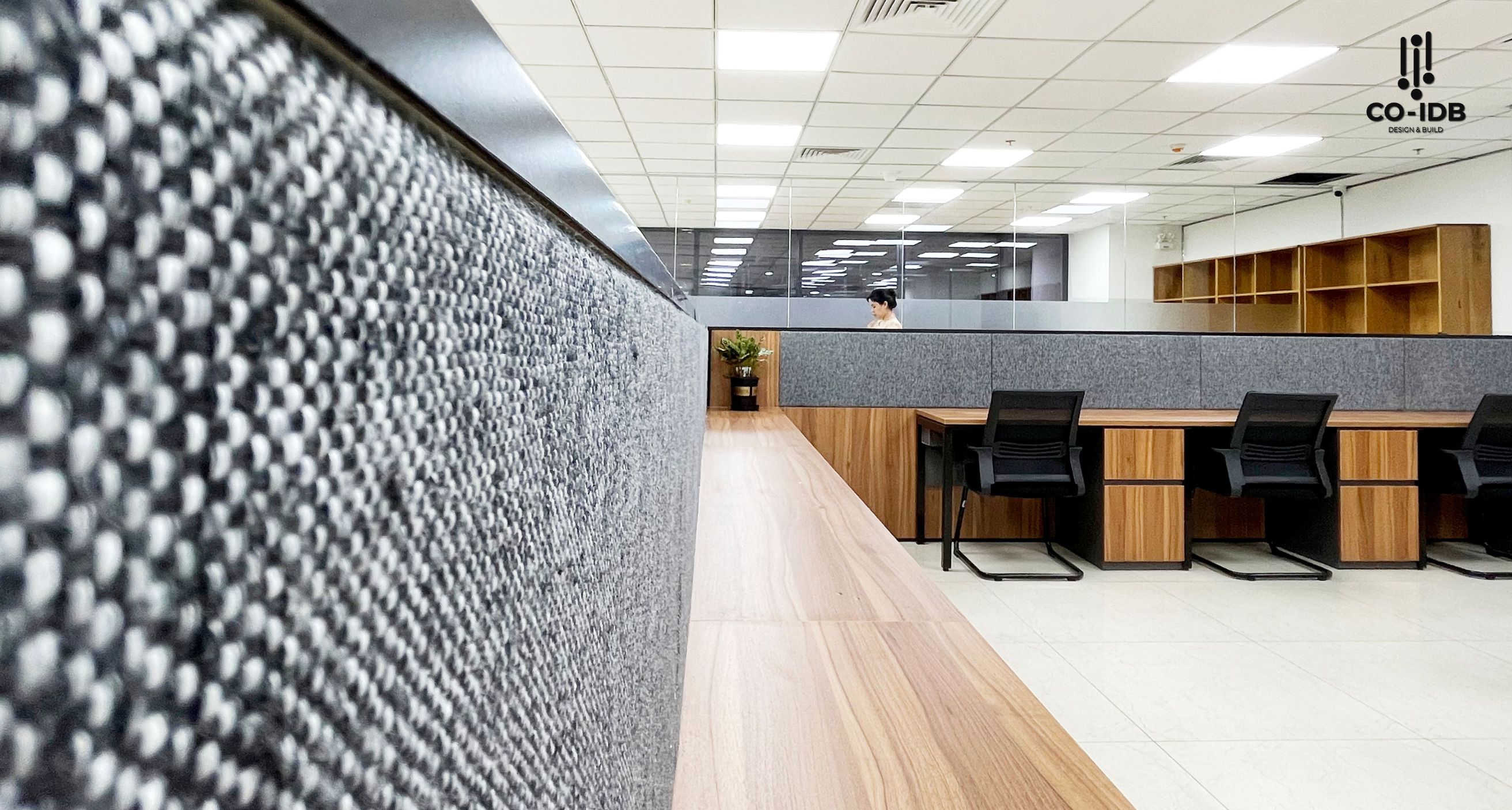
4. Creating a Professional and Luxurious Impression
-
Neutral colors with low saturation like gray, beige, or white create a modern and high-end feel.
-
Appropriate for reception areas and lounges, helping build a professional image for the business.

How to Choose the Right Saturation for the Office
Selection Based on Usage Duration
Working hours dictate the appropriate saturation level for each space. For long-term work areas, medium to low saturation (30-50%) creates an eye-friendly environment. In contrast, short-term usage areas can apply higher saturation (60-80%) to create impact and energy.

Saturation Based on Industry Specifics
Different industries require different approaches. IT/Technology companies often prefer medium to high saturation to foster a dynamic atmosphere. Conversely, Financial firms usually choose lower saturation to convey professionalism and trustworthiness.
Aligning with Brand and Company Culture
-
Reflecting the Brand: Using colors with saturation that matches your brand color palette strengthens identity and cultural consistency.
-
Ensuring Harmony: Color choices should be consistent with the style and values the company wants to project. Neutrals like gray, white, or beige typically feel modern and professional.

Using Design and Simulation Tools
-
Design Software: Tools like AutoCAD, SketchUp, or Canva allow testing of different saturation levels to visualize the space before implementation.
-
Lighting Simulation: Light can change color saturation. Use natural and artificial light simulations to ensure colors look good under all conditions.

Consulting Interior Design Experts
-
Expert Advice: Experienced designers like Co-IDB will provide advice on color schemes and saturation levels tailored to your specific office.
-
Sample Testing: Place color swatches on walls or furniture to observe changes in the actual space before making a final decision.

Common Mistakes in Using Saturation and How to Fix Them
Mistakes in using saturation can lead to negative impacts on the work environment. Recognizing and avoiding these ensures optimal design results.
Table 3: Common Mistakes and Solutions:
| Mistake | Impact | Solution |
| Saturation Overload | Visual fatigue | Reduce overall saturation; increase neutral color areas |
| Lack of Balance | Unprofessional look | Apply the 60-30-10 rule |
| Ignoring Light Conditions | Unexpected color effects | Test under multiple lighting conditions |

By studying and applying saturation principles, we see that this factor is not just about aesthetics—it is a strategic tool for optimizing productivity and building corporate culture. Organizations can create workspaces that are not only beautiful but truly support their mission and goals.
Read more: The Best Applications of Colors in Office Interior Design